Designing a home that feels cohesive, functional, and uniquely yours can be overwhelming. With endless décor trends, layout ideas, and style influences online, it’s hard to know what truly works for your space. This article is designed to cut through the noise and give you practical, design-forward guidance rooted in real interior strategy.
Whether you’re refreshing a single room or reimagining your entire home, we’ll explore smart space planning, timeless TH decor aesthetics, and the subtle but powerful role of color psychology in home design. You’ll discover how layout choices affect flow, how textures influence mood, and how intentional styling transforms ordinary rooms into elevated living spaces.
Our insights are grounded in proven interior design principles, trend analysis, and hands-on space optimization techniques. By the end, you’ll have clear, actionable ideas to create a home that not only looks beautiful—but feels intentionally designed for the way you live.
Your Home, Your Haven
Your home isn’t just walls and furniture; it’s an emotional ecosystem. I firmly believe most lingering stress at home isn’t about clutter—it’s about color. That dull gray that looked “modern” in the store? It might be draining you daily (yes, really).
Many overlook color psychology in home design, assuming trends matter more than temperament. I disagree. Trends fade; your nervous system doesn’t.
• Notice how soft blues can quiet a racing mind, while warm terracottas spark conversation.
The key is pairing light, room size, and personal taste. When color aligns with you, your space finally feels like a sanctuary.
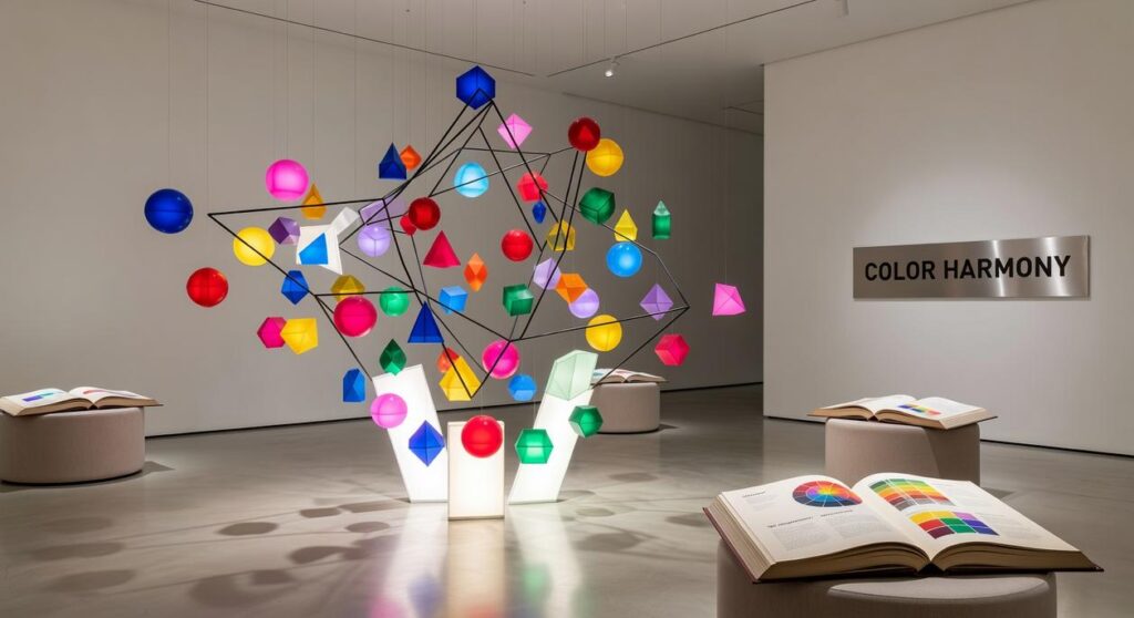
The science of sight begins with light. Different wavelengths enter the eye, where photoreceptors convert them into electrical signals the brain interprets as color. Shorter blue wavelengths often stimulate calm, slowing heart rate, while longer red wavelengths can heighten alertness and energy. These reactions are partly biological—blue mirrors sky and water, cues of safety—while others are learned, like white symbolizing purity in some cultures and mourning in others. Understanding this distinction helps you design with intention, not assumption.
Light itself is the hidden variable. A soft gray wall under cool morning light feels crisp and focused; under warm evening lamps, it turns cozy and intimate. That shift can make or break a room’s mood. When you use color psychology in home design, you gain control over atmosphere, productivity, and relaxation.
Key benefits:
- More cohesive spaces that feel balanced.
- Better sleep, focus, or social energy, depending on your goals.
The Calming Palette: Designing Sanctuaries for Peace and Focus
Creating a peaceful interior isn’t just about aesthetics; it’s about strategy. While many designers stop at “blue is calming” or “green feels fresh,” a deeper understanding of color psychology in home design reveals how specific shades shape behavior and mood.
1. The Nuance of Blues
Light, airy blues—think morning sky—reduce heart rate and encourage relaxation, making them ideal for bedrooms. In contrast, deep navy fosters concentration by minimizing visual distraction, which is why it works beautifully in home offices. Studies have linked blue environments to increased productivity and mental clarity (University of British Columbia, 2009). Still, critics argue blue can feel cold. The solution? Layer in warm woods or brass accents to prevent that corporate-boardroom vibe.
2. The Restorative Power of Greens
Green’s connection to nature supports stress reduction and emotional balance (American Psychological Association). Sage green creates a grounded, welcoming living room, while mint refreshes bathrooms with spa-like clarity. Some say green is “too safe.” Yet when paired with matte black fixtures or textured tile, it becomes quietly luxurious (proof that subtle doesn’t mean boring).
3. Mastering Layered Neutrals
Beige alone can fall flat. Instead, combine greys, taupes, and creams with tactile materials—linen drapes, stone surfaces, raw wood. Texture prevents monotony and anchors the space visually. This layered approach often gets overlooked by trend-focused competitors, yet it’s what makes rooms feel timeless.
For forward-thinking spaces, explore how palettes integrate with technology in the future of smart homes design meets technology.
The Energizing Spectrum: Inviting Joy, Creativity, and Warmth
Color does more than decorate a room—it influences how we feel and behave. In fact, research published in Frontiers in Psychology notes that warm colors like yellow and red can stimulate energy and positive mood responses. That’s the science behind using yellows and oranges to spark optimism.
For example, a soft butter yellow in the kitchen can encourage a cheerful start to the day, especially in spaces with natural morning light. Meanwhile, a burnt orange accent wall in a creative studio can subtly boost enthusiasm and idea generation (think of it as coffee for your walls). These choices align with established principles of color psychology in home design, which link warm hues to increased sociability and alertness.
However, some argue that bold warm tones overwhelm a space. That can be true—vibrant red has been shown to raise heart rate and stimulate appetite, according to research from the University of Rochester. Yet nuance matters. Softer terracotta or blush pinks provide warmth without intensity, making them ideal for dining rooms or reading nooks where comfort is key.
To balance vibrancy with harmony, apply the 60-30-10 rule: 60% dominant color, 30% secondary, 10% accent. This distribution ensures energy feels intentional, not chaotic. When thoughtfully layered, warm tones create spaces that feel alive yet welcoming.
Beyond the Paint: Applying Color Theory to Your Entire Space
Let’s challenge a common myth: bold color isn’t “too much.” Poorly applied color is. That’s where saturation and tone come in.
Saturation refers to a color’s intensity. A highly saturated blue is vivid and energetic (think a Mediterranean tile). A desaturated blue—muted with gray—feels calm and restorative, like a misty morning. Same hue. Totally different mood. This is the foundation of color psychology in home design, and it’s far more nuanced than “blue equals calm.”
Now, about space optimization. You’ve heard light colors make rooms feel bigger. True—because they reflect more light (U.S. Department of Energy notes lighter surfaces increase perceived brightness). But here’s the contrarian take: dark colors aren’t a mistake in small rooms. Deep charcoal or navy can blur edges and create intimacy, making a boxy room feel intentional rather than cramped (cozy beats clinical every time).
And color isn’t just for walls. Test palettes through:
- Cushions and throws
- Rugs and artwork
- Accent chairs
- Decorative objects
This layered approach lets you experiment without commitment. (Paint is permanent; pillows are forgiving.)
Pro tip: Start with one anchor piece—a rug or artwork—and pull supporting tones from it. Design feels cohesive when color conversations repeat.
Crafting Your Personal Color Story for a Healthier Home
Last year, I repainted my living room a muted blue and felt my shoulders drop for the first time in months. I realized then that color isn’t background noise; it’s a behavioral cue shaping mood and energy. That’s the promise of color psychology in home design: when you choose hues with intention, your space supports calm, focus, or joy instead of stress. Studies confirm surroundings affect stress (APA). Start small: create a mood board, gather textures and images you love, then pull two or three core colors to build your palette.
Bring Your Vision to Life with Confidence
You came here looking for clarity, inspiration, and practical direction to transform your space. Now you understand how intentional layouts, thoughtful decor choices, smart space optimization, and color psychology in home design work together to create a home that feels balanced, functional, and uniquely yours.
An uninspired or cluttered space can quietly drain your energy and limit your comfort. The right design approach changes that. With the right concepts and strategies, every room can feel purposeful, welcoming, and aligned with your lifestyle.
Now it’s time to act. Start by choosing one room and applying the principles you’ve learned—refine the layout, reassess your color palette, and incorporate decor that reflects your personality. If you want expert-backed ideas and proven strategies trusted by design enthusiasts who value both beauty and function, explore more of our design insights today.
Your space should inspire you daily. Take the next step and transform it into a home that truly works for you.