Standing in front of a wall of paint swatches, feeling completely overwhelmed? I’ve been there. Everything looks like a rainbow threw up, and you’re just trying to pick a color that won’t make your guests cringe.
Trends change faster than we can keep up with, and choosing a color for your home feels like a huge, expensive commitment you don’t want to screw up.
But here’s the thing: this guide is built on constantly observing what real designers and homeowners are using successfully. No fluff, just styles with staying power.
You’ll get a clear, simple breakdown of the most popular and livable color trends home. This isn’t just a list of trendy paint names. It’s about practical advice, showing you exactly how to bring these looks into your own space.
Stick around for inspiration and real-world tips.
The New Neutrals: Moving Beyond Gray
We’ve all seen it. Gray dominated everything for years. It was everywhere, from floors to walls.
But now, we’re shifting. The color trends home are moving toward something warmer, something more inviting. Enter the “new neutrals.” These are colors that still offer versatility but with added warmth and personality.
First up, earthy, warm beiges and “greige.” Think mushroom, taupe, and sand. These colors create a cozy, grounding atmosphere. They’re not just background players; they add depth.
Imagine a living room with taupe walls and a plush beige rug. It’s like a warm hug in color form.
Then we have warm, creamy whites. Not the cold, sterile whites that feel like a hospital hallway. I’m talking about ivory and oat milk.
These are soft, inviting, and perfect for a minimalist look. They aren’t just for walls either. Picture a bedroom with creamy white linens and natural textures like wood and linen.
It’s pure tranquility.
So where do you use these “new neutrals”? Living rooms and bedrooms are a great start. Pair them with natural textures like jute or linen.
It’s all about creating a space that feels alive yet soothing. Oh, and don’t forget to mix in some wood. These combinations make the colors pop.
And if you’re thinking about how this ties in with technology, rise smart home technology is a perfect match. They blend seamlessly with these tones, creating a harmonious balance between tech and warmth. So, are you ready to move beyond gray and embrace these new neutrals?
Nature-Inspired Palettes: Bringing the Outdoors In
I’ve always believed that colors have a way of transforming spaces. When you think of nature-inspired palettes, it’s really about bringing that outdoor freshness indoors. You know, the longing for a bit of the wild inside our concrete jungles.
Biophilic design taps into this, making us feel more alive at home.
Green is the star here. From soft sage to deep forest, each shade whispers something different. Soft sage is like a gentle breeze, calming and subtle.
On the other hand, emerald tones make bold statements, like a lush forest in summer. These greens can change the mood of a room entirely, making you feel at peace.
And let’s talk blues. Move over, navy. Muted dusty blues and serene teals steal the show.
They remind me of clear skies and calm seas. These shades can make any space feel expansive and airy. Imagine a bedroom painted in dusty blue.
It’s like a gentle hug at the end of a long day.
Then there are the earthy tones. Think terracotta, clay, and rich browns. These colors ground us, connecting us to the earth beneath our feet.
A terracotta accent wall in a dining area? That’s warmth and style wrapped up in one.
So how do you use these colors practically? A sage green kitchen can be a refreshing start to your day. A dusty blue bedroom invites relaxation.
And a terracotta wall? It’s a conversation starter. Color trends home, indeed.
Embrace these shades and watch your space transform.
Moody & Dramatic Hues: Cozy Luxe Spaces
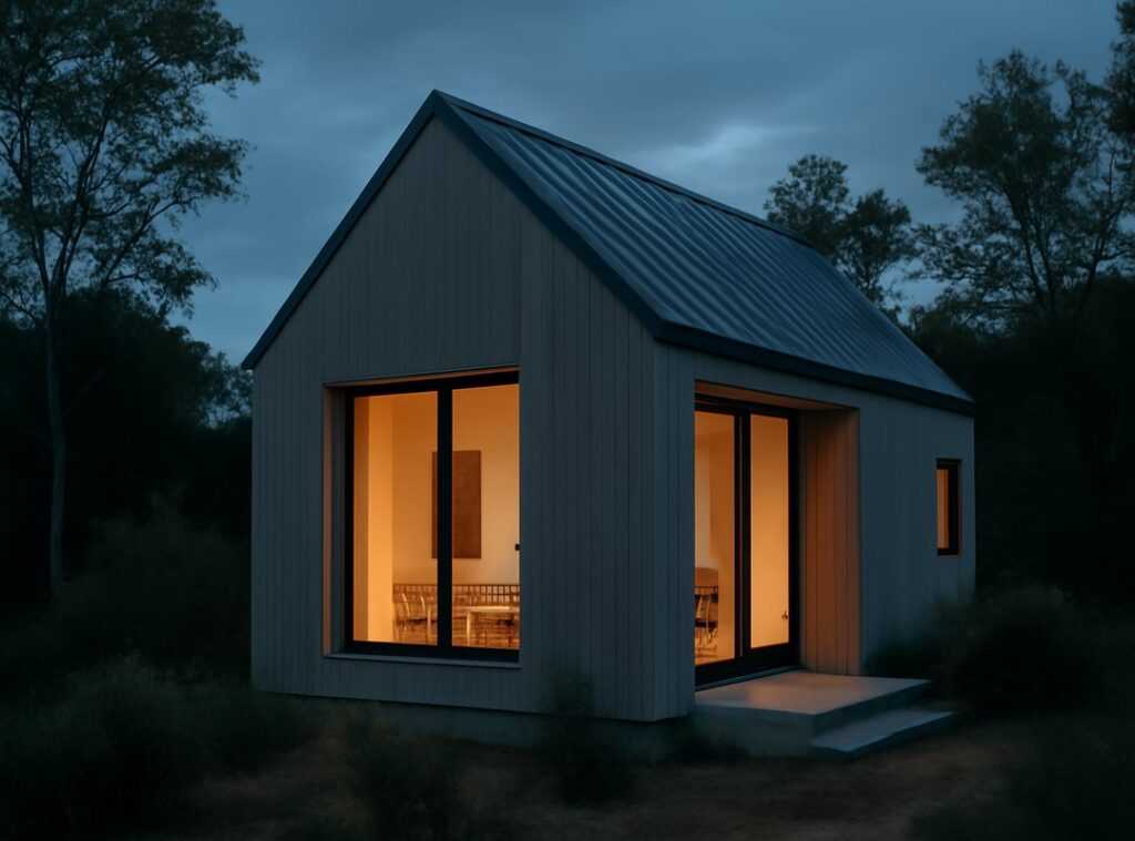
Are dark colors too daring for your home? Think again. Deep navy, charcoal gray, and rich plums are more than just trendy shades. These colors transform spaces into cozy retreats.
Imagine a room where you feel wrapped in a warm embrace. That’s the magic of using moody hues.
I know what you’re thinking. Will these colors make the room feel cramped? Good question.
The answer is no (if) you do it right. Use them in rooms with great natural light or small spaces like powder rooms. You want that jewel-box effect, right?
And let’s talk about pairing. Velvet furniture is a must. It adds that touch of luxury.
Throw in some brass or gold hardware. It makes everything look intentional. Warm, layered lighting seals the deal.
Your room will feel like a high-end lounge.
Pro tip: Use these colors on a single accent wall if you’re nervous. It’s easier to change if you don’t like it. But trust me, you will love it.
The room becomes a statement, not just a space.
When should you avoid these colors? Tiny rooms with no windows aren’t ideal. They could feel like a cave.
But who wants that? It’s all about balance and knowing your space.
Not just about aesthetics, creating this look can feel as important as having the must have home gadgets year to complete your home. Color trends home enthusiasts, are you ready to embrace the dark side?
The Color Code: Making the Right Choice for Your Home
Choosing the right color for your home isn’t just about following the latest color trends home. It’s about making it yours. Let’s be real (what) looks stunning in a magazine can look like a disaster under your living room’s light.
First, consider your home’s light. Natural light can be tricky. North-facing rooms often feel cooler, while south-facing spaces soak up warmth.
Artificial lights add another layer. Warm bulbs make colors pop differently than cool ones. Why trust a tiny swatch?
Paint a sample on different walls. Check it morning and night. You’ll thank me later.
Next, let’s talk about what you already have. Floors, countertops, and furniture aren’t changing overnight, are they? Your new color needs to complement, not clash.
Imagine a bold red against a mahogany floor. Sounds crazy, right? But it can work if you balance it right.
Now, what vibe do you want? Relaxed, energetic, cozy? The mood you want should guide your choices.
A calm space screams for blues and greens. Want energy? Go for yellows.
Feeling overwhelmed? Start small. Think accent pillows or a painted chair.
Maybe even an accent wall. You don’t need to dive headlong into painting a whole room.
Remember, it’s your space. Trust your gut. After all, you’re the one living there (not) some design guru.
Making your house a home is more than just following trends. It’s about feeling good in your space.
Joyful & Optimistic Accents: Adding a Pop of Personality
You ever notice how color can just change everything? After years of dull, minimalist designs, we’re finally seeing a shift. It’s about time we add some lively colors to our spaces, right?
But here’s the catch: it’s not about covering every inch of your room in neon paint. Instead, think smaller, intentional doses.
Consider this. A sunny yellow inside your bookshelf, or maybe a coral front door. It’s like adding a splash of personality without overwhelming the senses.
You could try colorful dining chairs or even bold artwork and textiles.
Doesn’t it sound like a breath of fresh air? These color trends home ideas are about expressing joy. It’s low-commitment, but the impact is huge.
Why not give it a shot?
Ready to Dive into Color?
Picking a paint color can freeze anyone in their tracks. But it doesn’t have to. You came here for clarity on color trends home, and you’ve got it.
You know the styles. You get how to match them to your space’s vibe. This isn’t just about picking a color; it’s about setting a mood.
So what’s next? Start small. Choose a couple of styles you love, grab those paint samples, and see how they look in your light.
Your perfect palette is waiting. Don’t just dream about it. Go test it now.
See the transformation in your space.
 Danielle Ariasimba specializes in the art of space optimization and the practical execution of TH decor aesthetics. With a talent for identifying the hidden potential in any floor plan, she provides the creative insights necessary to transform standard layouts into highly efficient and visually engaging environments. Her contributions ensure that every project maintains a balance between modern sophistication and the essential comforts of home.