Struggling to pull a room together so it feels balanced, cohesive, and professionally styled? You’re not alone. Many homeowners know what they like but aren’t sure how to combine colors, textures, and focal points without the space feeling overwhelming or unfinished. This article is designed to solve that problem by breaking down one of the most reliable design principles used by professionals: the 60-30-10 rule in interior design.
Here, you’ll learn exactly how this formula works, why it creates visual harmony, and how to apply it confidently in any room—whether you’re refreshing a living room, designing a bedroom, or updating a small apartment. We draw from established interior design principles, proven spatial strategies, and real-world styling applications to ensure the guidance is practical, clear, and easy to follow.
By the end, you’ll understand how to distribute colors with intention, create balance effortlessly, and design a space that feels polished rather than accidental.
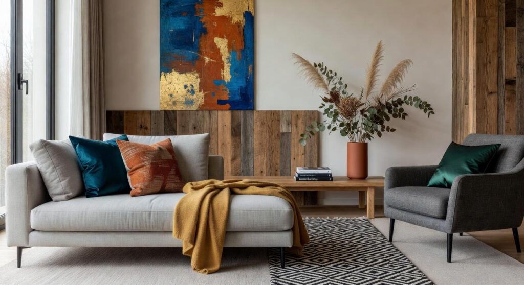
The difference between a chaotic room and a polished one often comes down to math. Specifically, the 60-30-10 rule in interior design. This formula divides your color palette into three intentional parts, and when applied correctly, it creates instant harmony.
Here’s what I recommend:
- Choose a dominant color for 60% of the room—walls, large rugs, or sofas.
- Add a secondary shade for 30%—curtains or accent chairs.
- Finish with a bold 10% pop—pillows or art.
As a result, your space feels balanced, not busy. Start simple; adjust slowly. Above all, trust your eye and refine thoughtfully over time.
Decoding the 60-30-10 Rule: Your Blueprint for Harmony
The 60-30-10 rule in interior design is a classic guideline for distributing color within a room. It suggests 60% of the space features a dominant color, 30% a secondary shade, and 10% a bold accent. This ratio works because the human brain craves balance. Studies in environmental psychology show that visually balanced spaces reduce cognitive load and improve mood (Journal of Environmental Psychology, 2019).
When 60% of a room shares one hue—think walls and large furniture—the eye settles. The 30% layer, perhaps curtains or chairs, adds variation without chaos. That 10%—pillows, art, a daring lamp—creates contrast and focal interest. Design case studies repeatedly demonstrate that rooms following this structure feel cohesive rather than cluttered.
Still, it’s a guideline, not a law. If your style leans maximalist, you might tweak the percentages (rules are made to be nudged). Use it as a blueprint.
Mastering Your Main Hue: The 60% Foundation
Your dominant color does the heavy lifting. It anchors the room, sets the emotional tone, and quietly supports everything layered on top. In the 60-30-10 rule in interior design, this 60% portion acts as the visual backdrop—think of it as the stage while the other elements perform.
So where should it go? Start with the largest surfaces. Walls are the obvious choice, but don’t stop there. Large area rugs, oversized sectionals, or major kitchen cabinetry can all carry your main hue. For example, a warm greige (a blend of gray and beige) on the walls paired with matching lower cabinets creates cohesion without feeling flat. In a living room, a soft navy sofa plus coordinating curtains can easily claim that 60% share.
When choosing your color, first evaluate lighting. North-facing rooms tend to feel cooler, so warmer neutrals balance them. Conversely, bright south-facing spaces can handle cooler or muted shades. Also consider fixed elements like flooring, countertops, or exposed brick—they’re non-negotiable, so your hue should complement them, not compete.
If you want longevity, lean into timeless neutrals. However, a muted version of your favorite color works beautifully too (bold, but not shouting). Pro tip: test large paint swatches and observe them morning and night before committing.
Layering with Personality: The 30% Secondary Shade
In the 60-30-10 rule in interior design, the 30% secondary shade is your supporting actor. It’s not the star of the show—that’s your dominant 60% color—but it’s the one that adds contrast, depth, and visual interest (think Sam to Frodo). Used at roughly half the volume of the dominant color, it should enhance the space without stealing the spotlight.
Where to Use Your Secondary Shade
Distribute it evenly so the room feels cohesive. I recommend incorporating it through:
- Accent chairs or a statement armchair
- Curtains or drapery panels
- Bed linens and layered throws
- Painted furniture pieces
- A single accent wall
The key is repetition. When the eye sees the color pop up in multiple places, the room feels intentional—not accidental.
Choosing the Right 30%
Start with compatibility. A monochromatic approach (a lighter or darker version of your dominant hue) creates a calm, layered look. Analogous colors—those sitting next to each other on the color wheel—offer harmony. Want more energy? Choose a complementary color for bold contrast.
If you’re unsure, test fabric swatches in natural and artificial light before committing. For a deeper dive, read how to balance color texture and pattern in any room.
Pro tip: If it feels loud, reduce the pattern scale—not the color.
The accent color is the jewelry of a room—the deliberate sparkle that turns “nice” into unforgettable. Within the 60-30-10 rule in interior design, that final 10% does more than decorate; it directs attention and injects personality.
However, most guides stop at “add a pop” and leave you guessing. Here’s the strategic difference:
- Repeat it in small, intentional doses—throw pillows, a bold lampshade, artwork details, or a ceramic vase.
- Create contrast against the dominant palette so the eye naturally lands there.
- Tie it to an existing undertone to avoid visual chaos (think ruby accents echoing a warm wood floor).
Some designers argue bold colors overwhelm a calm space. Yet, when confined to 10%, even emerald or matte black feels curated, not chaotic.
Pro tip: test your accent with removable items first.
Ultimately, this is your moment for high-gloss metallics, graphic patterns, or that fearless cobalt you secretly love.
Beyond Paint: Applying the Ratio to Texture and Materials
Most people treat the 60-30-10 rule in interior design as a color cheat code. I think that’s limiting. In my experience, it’s really about proportional balance—how a room feels, not just how it looks.
For example, try 60% smooth surfaces (painted walls, sleek floors), 30% soft fabrics (linen curtains, a velvet sofa), and 10% rough, natural elements (a wooden coffee table, a stone vase). Suddenly, the space has depth.
Granted, some argue texture mixing complicates things. I disagree. When balanced thoughtfully, contrast creates character (and prevents that showroom-flat vibe).
Design doesn’t have to feel like a guessing game. In fact, the 60-30-10 rule in interior design proves structure fuels creativity, not limits it. While some argue strict ratios stifle self-expression, the opposite is usually true: boundaries create confidence (ever notice how a great outfit follows a formula?). By clarifying visual hierarchy—60 percent dominant, 30 percent secondary, 10 percent accent—you remove decision fatigue and gain balance that simply feels right.
Now, take a fresh look at one room. What proportions already exist? More importantly, what would shift if you adjusted them intentionally? Start planning your next intentional refresh today confidently.
By understanding the 60-30-10 rule, you can create a balanced and inviting space, which can be further enhanced with practical suggestions from our article on Decoradhouse Upgrade Tips By Decoratoradvice.
Bring Balance and Beauty Into Your Space Today
You came here to finally understand how to make your space feel cohesive, balanced, and professionally styled without guessing your way through it. Now you know how the 60-30-10 rule in interior design creates visual harmony by giving every room a clear structure, purpose, and flow.
If your home has ever felt “off,” cluttered, or incomplete, it’s likely because the colors and proportions weren’t working together. That frustration ends when you apply this simple formula with intention. A dominant 60%, a supportive 30%, and a bold 10% accent can instantly transform a flat room into a thoughtfully designed space.
Don’t let another room feel unfinished or mismatched. Start by choosing your dominant base color, layer in your secondary tone, and finish with a confident accent that adds personality. If you’re ready to stop second-guessing your decor choices and want proven, design-forward guidance that delivers real results, explore our expert styling insights and start redesigning your space today.
 Kelrisa Talvess founded Tht Homedec with a mission to bridge the gap between high-level interior design strategies and practical, everyday living. By blending sophisticated TH decor aesthetics with innovative space optimization tips, she has created a platform that empowers individuals to master their own home concepts. Kelrisa’s approach centers on the belief that creative insights should be both inspiring and functional, ensuring that every curated environment is as efficient as it is beautiful.